After over a year away, the Counting On A Package Deal series has returned. For those not in the know, this is a series of posts that I went through in 2015, where I dissected the packaging of Springsteen's discography. While seemingly discontinued after my Born In The U.S.A. post, I was fortunate enough to receive the following gift:
Yes, that leaping lothario is the Boss, posing for his "Dancing In The Dark" single cover. This particular record is an unusual 12" single, featuring a dance club "Blaster Mix" version of the song. But, I'm not here to break down the music, I'm just judging the aesthetics of the package. This cover is easily Springsteen's most active. Most albums just show his face, and on the rare moments of below-neck Springsteen shots, he's just leaning on cars (Tunnel of Love), walls (back of Wild, Innocent, and the E Street Shuffle), or bandmates (Born To Run). Here, Springsteen is getting some serious air. And the moves don't just stop on the front cover.
On the back, Springsteen gets right up on his tip-toes. Perhaps a challenge to the King of Pop himself, who was also huge in the mid-80s? He also tops off the move with a straightening of the jacket. Nice work, Bruce.
Finally, the record itself varies in no way, shape, or form from all of Springsteen's other Columbia records. I wore out this schtick in the previous six entries.
So, that'll do it for this installment of Counting On A Package Deal. Hopefully, I can receive more random gifts like this one!
Want to start your own record collection? Buy it on Amazon!
Past installments:
Greetings from Asbury Park
The Wild The Innocent & The E Street Shuffle
Born To Run
Darkness on the Edge of Town
The River
Born In The U.S.A.
Showing posts with label Album Covers. Show all posts
Tuesday, July 5, 2016
Tuesday, June 30, 2015
Counting On A Package Deal, Part 6 - Born In The USA
Now, loyal readers of Counting On A Package Deal may be asking, "Hey Goober, where's Nebraska?" Don't worry, I have a very good reason for not covering Nebraska: I don't own it. Seriously, I didn't buy any of these albums - they were all given to me by a family friend. If you want to help my collection, I will gladly accept donations. But, sadly, this blog doesn't quite pay the bills (yet!).
Born In The USA is easily Springsteen's second most famous album cover. This photo by Annie Leibovitz was destined to become iconic, and it seems like the Springsteen album design department knew it, because check out the back of the record:
Yup, just the same image again. I mean, come on fellas. That's just too much butt. It's the first, and as far as I know, only time that the front and back of an album have been completely identical. It makes me wistful for The River's horror show photograph.
The inside sleeve isn't as good as The River's was, but that was a tough one to top. However, for the first time, each individual E Street Band member gets their own spotlight photo, with the largest photos going to Clarence and, surprisingly, Garry Tallent. On the reverse of the sleeve, we get an in-color photo of Bruce - the largest color photo showing Bruce's face since Darkness. This would've been perfect for the back cover!
And there's a lyrics sheet. These are fine. Can't really say much about these.
And, that's it. We've reached the end of Counting On A Package Deal until I get any more albums. But what's that you say? What does the record look like? Is it just another red circle? Well, you asked, and I shall deliver:
Remember, you asked.
Want to start your own record collection? Buy it on Amazon!
Past installments:
Greetings from Asbury Park
The Wild The Innocent & The E Street Shuffle
Born To Run
Darkness on the Edge of Town
The River
Born In The USA is easily Springsteen's second most famous album cover. This photo by Annie Leibovitz was destined to become iconic, and it seems like the Springsteen album design department knew it, because check out the back of the record:
Yup, just the same image again. I mean, come on fellas. That's just too much butt. It's the first, and as far as I know, only time that the front and back of an album have been completely identical. It makes me wistful for The River's horror show photograph.
The inside sleeve isn't as good as The River's was, but that was a tough one to top. However, for the first time, each individual E Street Band member gets their own spotlight photo, with the largest photos going to Clarence and, surprisingly, Garry Tallent. On the reverse of the sleeve, we get an in-color photo of Bruce - the largest color photo showing Bruce's face since Darkness. This would've been perfect for the back cover!
And there's a lyrics sheet. These are fine. Can't really say much about these.
And, that's it. We've reached the end of Counting On A Package Deal until I get any more albums. But what's that you say? What does the record look like? Is it just another red circle? Well, you asked, and I shall deliver:
Remember, you asked.
Want to start your own record collection? Buy it on Amazon!
Past installments:
Greetings from Asbury Park
The Wild The Innocent & The E Street Shuffle
Born To Run
Darkness on the Edge of Town
The River
Tuesday, May 5, 2015
Counting On A Package Deal, Part 5 - The River
Today, on 5/5, we'll be examining Springsteen's fifth album, The River. This package is full of tons of goodies, so sit back and enjoy a nice, lengthy article. And, by that, I mean a ton of photos, because that's what you are really here for, right? The cover is the simplest to date: Springsteenface. Nothing to see here. But the back? Good lord.
This might be the first time I've seen the back of The River album, and goodness, what on Earth is going on? There's creepy wedding decorations, and American flag with its own bald eagle, and various other party decorations like glitter, glue sticks, and cups. I can see why the back of The River has never reached the notoriety of other Springsteen black-and-white photos, such as Nebraska. This is downright scary and confusing. I assume it has something to do with all the weddings discussed in songs such as "The River" and "I Wanna Marry You", but the overall effect is horrifying. It's one of those images that, if you encountered at a very young age, would be forever burned into your sub-conscience. To pacify myself, I'll say that, seeing the name "Charlie" in the background and the American flag/eagle combination, this photo served as inspiration for Charlie Kelly's "Rock Flag & Eagle" song.
The album doesn't unfold ala Born To Run, but each album comes in its own sleeve. These sleeves are amazing. Presented, in order, are album one's sleeve and album two's sleeve (both sides of each). Please, take your time to absorb these all, I'll still be here when you are done:
Go back and look one more time. Tons of classic, old-school photos of the Boss and crew in their primes. The E Street Band had been missing from Bruce's album packaging since The Wild, but they make up for lost time here. And, guess what? There's more!
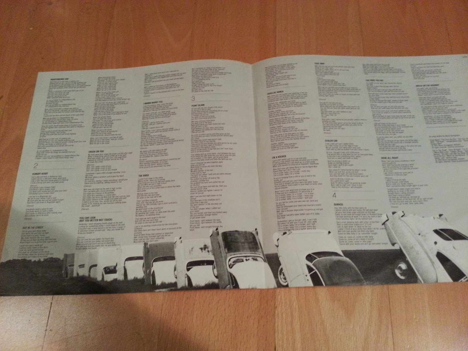
Like Darkness, The River has a separate sheet for Springsteen's lyrics. Unlike Darkness, we get more photos of the band (plus some funky used car art).
Overall, I absolutely love the packaging for The River. This is exactly what I want to compliment the music I'm listening to: pictures of the band that performed it! The only thing that can make this better is if they varied the record label, right? I mean, it's been four records in a row of the same red circle? Surely, with two records, they will HAVE to change it! I can't wait to see what they went with!
...I brought this upon myself.
Want to start your own record collection? Buy it on Amazon!
Past installments:
Greetings from Asbury Park
The Wild The Innocent & The E Street Shuffle
Born To Run
Darkness on the Edge of Town
Tuesday, April 7, 2015
Counting On A Package Deal, Part 4 - Darkness On The Edge Of Town
In the last installment of Counting, we saw Bruce turn into a superstar with Born To Run. The years following Born To Run were a bit tumultuous for Springsteen, as he split from his manager Mike Appel, leading to his most somber album to date, the appropriately titled Darkness On The Edge Of Town.
Not only are the songs dark, but the album packaging is Bruce's most brooding to date. Gone is the smiling man on a stamp from Greetings, the shirtless goofballs from Wild, or the slyly-grinning shaggy-bearded scamp from Born To Run. Darkness only gives us three photos of Bruce, and none of the E Street band members. First, the cover: Bruce staring dead-eyed forward, with a jacket.
Next, the back cover: Bruce staring dead-eyed forward, without a jacket (and with remarkably hairy arms).
Finally, the inside sleeve: Bruce, staring dead-eyed forward, with the jacket back on. It's worth noting that this is the first album with a unique inside sleeve since Greetings.
In a first for Springsteen albums, there is an insert inside the record: a sheet of paper with all the lyrics. Personally, I prefer seeing the lyrics printed on the record package itself - the sheet of paper seems like an afterthought and could easily get lost.
So, overall, this package is like the music itself: simple, dark, and a departure from Springsteen's previous works. It's probably the least exciting packaging I've reviewed so far, but in a way, it totally fits.
And yes, the record still looks the same as the rest. God bless you, red Columbia circle.
Want a copy to call your own? Purchase it here!
Further reading: Greetings from Asbury Park; The Wild, the Innocent, and the E Street Shuffle; Born to Run
Not only are the songs dark, but the album packaging is Bruce's most brooding to date. Gone is the smiling man on a stamp from Greetings, the shirtless goofballs from Wild, or the slyly-grinning shaggy-bearded scamp from Born To Run. Darkness only gives us three photos of Bruce, and none of the E Street band members. First, the cover: Bruce staring dead-eyed forward, with a jacket.
Next, the back cover: Bruce staring dead-eyed forward, without a jacket (and with remarkably hairy arms).
Finally, the inside sleeve: Bruce, staring dead-eyed forward, with the jacket back on. It's worth noting that this is the first album with a unique inside sleeve since Greetings.
In a first for Springsteen albums, there is an insert inside the record: a sheet of paper with all the lyrics. Personally, I prefer seeing the lyrics printed on the record package itself - the sheet of paper seems like an afterthought and could easily get lost.
So, overall, this package is like the music itself: simple, dark, and a departure from Springsteen's previous works. It's probably the least exciting packaging I've reviewed so far, but in a way, it totally fits.
And yes, the record still looks the same as the rest. God bless you, red Columbia circle.
Want a copy to call your own? Purchase it here!
Further reading: Greetings from Asbury Park; The Wild, the Innocent, and the E Street Shuffle; Born to Run
Tuesday, February 24, 2015
Counting On A Package Deal, Part 3 - Born To Run
This album needs no introduction:
Simple. Clean. Iconic. Timeless. Rock & Roll. An album cover hasn't matched its content quite like that of Born To Run. While this is just the albums front, as every true fan knows, it is best viewed unfolded:
Yes, we get the Big Man, with his shirt significantly more buttoned-up than on Wild (his hat grew in size and style, too). I do enjoy when an album package has a "gimmick", like the postcard on Greetings, and here we get the front-and-back spread. This is the only Springsteen album where the front bleeds into the back - in fact, I'm having difficulty thinking of other albums that employ this technique (the only one that comes to mind is LCD Soundsystem's This Is Happening). To the left of Clarence, we get the track listing, as well as full credits for every performer. The interior of the package is excellently done, too:
A shot of our star, and every lyric from "The screen door slams" to "Tonight in Jungleland", nicely spaced out and not hard to read. Honestly, just on packaging alone, music fans in the 70s must have known they were in for something special. I cannot heap enough accolades on this album design. It is perfect in nearly every way (my only minor quibble is that I'd like to see more of the E Street Band than Clarence). Greetings introduced you to Bruce, focusing on his roots and his lyrics. Wild ditched the lyrics and focused on building the E Street legend. But, here, on Born To Run, the world was introduced to Bruce Springsteen: Rock Star.
For completeness sake, here's the record. Yes, another red circle in a larger black circle. One day we may see another color. One day...
Want a copy to call your own? Purchase it here!
For more reviews of old records, check out part one and part two!
Simple. Clean. Iconic. Timeless. Rock & Roll. An album cover hasn't matched its content quite like that of Born To Run. While this is just the albums front, as every true fan knows, it is best viewed unfolded:
Yes, we get the Big Man, with his shirt significantly more buttoned-up than on Wild (his hat grew in size and style, too). I do enjoy when an album package has a "gimmick", like the postcard on Greetings, and here we get the front-and-back spread. This is the only Springsteen album where the front bleeds into the back - in fact, I'm having difficulty thinking of other albums that employ this technique (the only one that comes to mind is LCD Soundsystem's This Is Happening). To the left of Clarence, we get the track listing, as well as full credits for every performer. The interior of the package is excellently done, too:
A shot of our star, and every lyric from "The screen door slams" to "Tonight in Jungleland", nicely spaced out and not hard to read. Honestly, just on packaging alone, music fans in the 70s must have known they were in for something special. I cannot heap enough accolades on this album design. It is perfect in nearly every way (my only minor quibble is that I'd like to see more of the E Street Band than Clarence). Greetings introduced you to Bruce, focusing on his roots and his lyrics. Wild ditched the lyrics and focused on building the E Street legend. But, here, on Born To Run, the world was introduced to Bruce Springsteen: Rock Star.
For completeness sake, here's the record. Yes, another red circle in a larger black circle. One day we may see another color. One day...
Want a copy to call your own? Purchase it here!
For more reviews of old records, check out part one and part two!
Tuesday, January 20, 2015
Counting On A Package Deal, Part 2 - The Wild, The Innocent, & the E Street Shuffle
Welcome to the second installment of Counting On A Package Deal. If you missed part one, never fear - somehow, it is still online! Here, we tackle Bruce's second album, The Wild, the Innocent, & the E Street Shuffle.
Released just eight months after Greetings, the packaging here differs quite starkly when compared to its predecessor. In fact, stark is almost all you need to say about The Wild's packaging. The cover is straight to the point: HERE'S BRUCE. There's no fold out gimmicks, just total Bruce Springsteen. The back cover is just as simple:
While Greetings was jammed full of lyrics on the back cover, this just simply shows the long hair and bare chests of the E Street Band. Vini "Mad Dog" Lopez is the star of this photo, and people new to the E Street Band would assume he was Bruce Springsteen due to his prominent placement here.
Continuing in the simplicity, I cannot find any sleeve associated with this album, so I'm assuming it came in plain, white paper (please correct me if I'm wrong - I'm a horrible researcher). There are no lyrics printed anywhere here, sentencing fans to have to listen to "Rosalita" over and over again to get the words right (well, there are worse ways to spend one's time).
So there you have it - from a fold out cover and tons of lyrics to Big Faced Bruce and the Chesty E Street Band. Oh, and remember how I said all the records look the same? Well, I wasn't lying:
That's Greetings on the left and Wild on the right. Or maybe it's Wild on the left and Greetings on the right? I'm starting to see why we left these frustrating old things in the dust 30 years ago.
Want a copy to call your own? Purchase it here!
Click here for part one of Counting On A Package Deal: Greetings From Asbury Park.
Released just eight months after Greetings, the packaging here differs quite starkly when compared to its predecessor. In fact, stark is almost all you need to say about The Wild's packaging. The cover is straight to the point: HERE'S BRUCE. There's no fold out gimmicks, just total Bruce Springsteen. The back cover is just as simple:
While Greetings was jammed full of lyrics on the back cover, this just simply shows the long hair and bare chests of the E Street Band. Vini "Mad Dog" Lopez is the star of this photo, and people new to the E Street Band would assume he was Bruce Springsteen due to his prominent placement here.
Continuing in the simplicity, I cannot find any sleeve associated with this album, so I'm assuming it came in plain, white paper (please correct me if I'm wrong - I'm a horrible researcher). There are no lyrics printed anywhere here, sentencing fans to have to listen to "Rosalita" over and over again to get the words right (well, there are worse ways to spend one's time).
So there you have it - from a fold out cover and tons of lyrics to Big Faced Bruce and the Chesty E Street Band. Oh, and remember how I said all the records look the same? Well, I wasn't lying:
That's Greetings on the left and Wild on the right. Or maybe it's Wild on the left and Greetings on the right? I'm starting to see why we left these frustrating old things in the dust 30 years ago.
Want a copy to call your own? Purchase it here!
Click here for part one of Counting On A Package Deal: Greetings From Asbury Park.
Tuesday, December 30, 2014
Counting On A Package Deal, Part 1 - Greetings From Asbury Park
Being the mini-hipster that I am, I have found my apartment infested with a vinyl record collection. I don't know how or when this happened - I just moved to Brooklyn about two years ago, and within weeks, there they were. While I'm not as much of an audiophile to claim that I can hear a huge difference in sound quality, I do enjoy owning stuff. And, what better stuff to own than trendy, hopelessly outdated, will-be-annoying-to-move-when-I-switch-apartments pieces of Springsteen memorabilia?
So, in this new series Counting On A Package Deal, I will be reviewing the packaging of these Springsteen records. No, I won't be discussing any of the songs. No, I will not be dissected the cover art. Just, you know, the box it came in. Still with me? Yes? God bless you.
So, first up, we've got Greetings From Asbury Park, Springsteen's debut album. Here, we've got a standard looking record. While the front features very little to identify this as anything other than "Jersey music", the back tells another story:
Flip the record over, The back is crammed with Springsteen's crazy lyrics and a small picture of the young rascal. It really shows off Springsteen's early, more verbose songs, as they can barely fit 5 songs on the back (although there is a tremendous excess of empty space at the bottom. So far, it's a pretty by-the-book album package, but what's this?
The post-card is die-cut, revealing more lyrics! It's extremely simple, but I must say, I do not own any other albums that make use of such a gimmick. Plus, take a closer look at the back of the fake postcard - you even get to see little Bruce's face on a fake stamp (sadly, an honor we couldn't get Clarence Clemons).
The album is nothing special, as we get the red Columbia records label. That's something I have to give credit to CDs for - in their later years, they would make the discs stand-out more. A spoiler alert for future Package Deal posts: you will be hard-pressed to tell the difference between Springsteen records, and probably assume I'm just re-using the same photo.
Sadly, the original record sleeve seems to have been lost to the ages, so I'll have to make due with the tiny pictures and microscopic notes that accompany the re-released CD. I'm sure there's some fun Bruce stuff I could make snarky jokes about in here, but I'm not going to strain my eyes reading 2 point font.
So, there you have it: the first (and hopefully not last) installment of Counting On A Package Deal. I hope you had fun reading it, or, failing that, I hope you enjoyed scrolling through the pictures.
Want a copy to call your own? Purchase it here!
So, in this new series Counting On A Package Deal, I will be reviewing the packaging of these Springsteen records. No, I won't be discussing any of the songs. No, I will not be dissected the cover art. Just, you know, the box it came in. Still with me? Yes? God bless you.
So, first up, we've got Greetings From Asbury Park, Springsteen's debut album. Here, we've got a standard looking record. While the front features very little to identify this as anything other than "Jersey music", the back tells another story:
Flip the record over, The back is crammed with Springsteen's crazy lyrics and a small picture of the young rascal. It really shows off Springsteen's early, more verbose songs, as they can barely fit 5 songs on the back (although there is a tremendous excess of empty space at the bottom. So far, it's a pretty by-the-book album package, but what's this?
The post-card is die-cut, revealing more lyrics! It's extremely simple, but I must say, I do not own any other albums that make use of such a gimmick. Plus, take a closer look at the back of the fake postcard - you even get to see little Bruce's face on a fake stamp (sadly, an honor we couldn't get Clarence Clemons).
The album is nothing special, as we get the red Columbia records label. That's something I have to give credit to CDs for - in their later years, they would make the discs stand-out more. A spoiler alert for future Package Deal posts: you will be hard-pressed to tell the difference between Springsteen records, and probably assume I'm just re-using the same photo.
Sadly, the original record sleeve seems to have been lost to the ages, so I'll have to make due with the tiny pictures and microscopic notes that accompany the re-released CD. I'm sure there's some fun Bruce stuff I could make snarky jokes about in here, but I'm not going to strain my eyes reading 2 point font.
So, there you have it: the first (and hopefully not last) installment of Counting On A Package Deal. I hope you had fun reading it, or, failing that, I hope you enjoyed scrolling through the pictures.
Want a copy to call your own? Purchase it here!
Tuesday, February 25, 2014
Pictures of Heroes on the Wall - A Look Back At Springsteen's Album Covers
The release of High Hopes brought upon it many mixed reviews, but the critics could all agree on one thing: the album cover sucked. It was yet another uninspired, blurry Springsteen photo, reminiscent of The Rising. It's been a problem Springsteen's albums have had for years, and it only seems to be getting worse. The issue here is that there has been little variation in Springsteen's cover album shots, as they generally fall into one of three categories: Bruce leaning on a car, Bruce performing to a crowd, and Bruce's face. Let's take a look into each version:
1. Leaning On A Car
Examples: Tunnel of Love; Girls In Their Summer Clothes EP; Greatest Hits (2009); The Promise
It started with Tunnel of Love, with a simple shot by Annie Leibovitz and Springsteen rocking a nifty bolo tie. Since then, this technique has been used a few more times, with the most cringe-worthy example being the limited released Greatest Hits album released in 2009. Here, Springsteen poses on a motorcycle, trying hard to look "cool", but due to his age, he's giving off a mid-life crisis vibe. My personal favorite is The Promise, which is a beautiful shot from Springsteen's youth. It's unassuming and simple; rather than forcing you to know that this is a Springsteen album, it slowly draws you in. The deserted road and ominous clouds causes you to find yourself as pensive and contemplating as Bruce is in the photo. The cover of The Promise is easily one of the best Springsteen album covers to date, showing that the "lean on a car" concept still has potential.
2. LIVE!
Examples: Live/1975-85; In Concert - MTV Unplugged Film; Live In New York City; Hammersmith Odeon; Live In Hyde Park
It's a familiar line from every Springsteen fan: "You have to see him live!" In fact, I'm even starting to get sick of hearing how great he is live...but he is! It is tough to capture the power of a Springsteen concert in a single image, but I feel the 1975-85 collection and the Hammersmith Odeon cover do an admirable job. Those covers capture a Springsteen mid-concert, and you can feel his exhaustion as he is pushing his stamina to give his all to his fans. However, the live cover trope has a few stinkers, specifically the uninspired Live In New York City (which is such a disappointment for such a fantastic live album) and the MTV Unplugged album (which is easily my least favorite Springsteen album cover - it looks like a cheesy wedding photo).
3. Big 'Ole Bruce Faces
Examples: The Wild, The Innocent, and the E Street Shuffle; The River, The Essential Bruce Springsteen; Devils & Dust; Magic; Working On A Dream
Easily the most over-used of the Springsteen cover motifs, and these are the most difficult to defend. It's.....Springsteen's face. We get it. There is little mystery when picking up one of these albums: you are getting a bunch of songs by Bruce Springsteen. It's become more frequent in modern times, the obviousness of this design only being usurped by the Wrecking Ball cover which has the words "BRUCE SPRINGSTEEN" taking up 80% of the cover.
Bruce has the capacity for iconic covers. Born To Run and Born In The U.S.A. are not just two of the most iconic rock-and-roll records of all-time, but two of the most iconic rock-and-roll album covers of all time. An album cover is your gateway to the world that the music inside will create for you, and it is an opportunity to create a concrete visual forever associated with the songs inside. That is a bit flowery and pretentious, but I can't help it: I like a good album cover. I look at some of the great images mentioned in this article, and I know Bruce can do better. I've got my fingers crossed he'll prove me right in the future.
It's a familiar line from every Springsteen fan: "You have to see him live!" In fact, I'm even starting to get sick of hearing how great he is live...but he is! It is tough to capture the power of a Springsteen concert in a single image, but I feel the 1975-85 collection and the Hammersmith Odeon cover do an admirable job. Those covers capture a Springsteen mid-concert, and you can feel his exhaustion as he is pushing his stamina to give his all to his fans. However, the live cover trope has a few stinkers, specifically the uninspired Live In New York City (which is such a disappointment for such a fantastic live album) and the MTV Unplugged album (which is easily my least favorite Springsteen album cover - it looks like a cheesy wedding photo).
3. Big 'Ole Bruce Faces
Examples: The Wild, The Innocent, and the E Street Shuffle; The River, The Essential Bruce Springsteen; Devils & Dust; Magic; Working On A Dream
Easily the most over-used of the Springsteen cover motifs, and these are the most difficult to defend. It's.....Springsteen's face. We get it. There is little mystery when picking up one of these albums: you are getting a bunch of songs by Bruce Springsteen. It's become more frequent in modern times, the obviousness of this design only being usurped by the Wrecking Ball cover which has the words "BRUCE SPRINGSTEEN" taking up 80% of the cover.
Bruce has the capacity for iconic covers. Born To Run and Born In The U.S.A. are not just two of the most iconic rock-and-roll records of all-time, but two of the most iconic rock-and-roll album covers of all time. An album cover is your gateway to the world that the music inside will create for you, and it is an opportunity to create a concrete visual forever associated with the songs inside. That is a bit flowery and pretentious, but I can't help it: I like a good album cover. I look at some of the great images mentioned in this article, and I know Bruce can do better. I've got my fingers crossed he'll prove me right in the future.
Subscribe to:
Posts (Atom)